What is the key to creating products that are easy and pleasant to use? For the answer to this question, we first need to take a look at user experience (UX) and usability and what they mean.
UX is a hot topic right now in the SW industry, but there are several different definitions of it and even some misinterpretations of its meaning. For example, some stakeholders see it only as visual design trends, nice colors and pictures or personal opinions. It is much more than that, however.
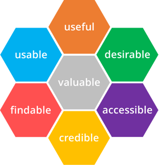
A common view is that UX consists of at least “traditional” usability and emotional aspects, such as feelings, trends, social value and brand/image. A well-known ISO standard (9241-210) defines UX as “a person’s perceptions and responses that result from the use or anticipated use of a product, system or service.” Another example of UX definitions is Peter Morville’s UX Honeycomb, which illustrates the facets of UX.

Figure 1. Peter Morville’s UX Honeycomb and facets of UX
All UX elements are important, but I would say usability is a cornerstone of the overall UX. It is impossible to achieve a great UX without high-quality usability, which is based on professional interaction design. As an example, Don Norman says that Apple’s design is getting worse because they focus on aesthetics over functionality (and well-established principles of good design). In general, even nice visual design can’t make a user interface (UI) good if it has been built on top of poor interaction design.
What is Usability?
As usability is an important part of the overall UX, this blog text focuses on the basics of it. After a period of being a less trendy topic in the industry, I believe usability is becoming more popular again. Also, the significance of good usability is even greater when designing enterprise systems. To gain a better understanding of what usability means, let’s take a look at two widely recognized definitions of usability: an ISO standard concerning usability and Jacob Nielsen’s usability attributes.
The ISO 9241-11 standard explains how to identify the information that must be taken into account when specifying or evaluating usability. The purpose is to provide a consistent and agreed framework of the key usability parameters. According to it, usability consists of the following measurable elements: effectiveness, efficiency and satisfaction. Furthermore, the context of use must be taken into consideration.
Nielsen's usability definition has probably had the biggest impact on usability thinking overall. While the ISO definition has three aspects, Nielsen divides usability into five elements, so-called attributes, which can be measured and used to specify usability objectives. They are learnability, efficiency, memorability, errors and satisfaction.
 Figure 2. Jacob Nielsen’s usability attributes
Learnability is a fundamental usability attribute, because most systems need to be easy to learn, and it affects the first impression with a system. Basically, ease of learning means that a user must be able to learn how to use a system as quickly and as easily as possible. However, different learning times are acceptable, depending on the type of system. If a UI is intended for a specific purpose for advanced users, the learning time can be longer. In interaction design, e.g. using both icons and text labels for action buttons makes learning easier.
Efficiency means how fast a user can perform tasks once she has learned to use a system. There are also some users who don't need to learn to use a system fully, but are satisfied when they have learned its basic functionality. One way to improve efficiency is by adding hidden shortcuts for frequently used functions. Also, simplicity in interaction and visual design can make a more efficient UI possible, if done properly. In his book “About Face: The Essentials of Interaction Design”, Alan Cooper cites Antoine de Saint-Exupéry’s aphorism providing a good design philosophy: “Perfection is achieved not when there is no longer anything to add, but when there is no longer anything to take away.”
Memorability applies to users who have already become familiar with a system, but some breaks occur in using it or they use it very seldom. Memorability measures how well users can remember different functions after they have learned the functions. This kind of use is typical e.g. with programs that are used to run monthly reports.
The UI should be clear enough so that the users make as few errors as possible. An error can be defined as a function performed by a user that does not lead to the aimed result. When the number of errors is counted, the error frequency of a system is achieved as the result. Simple errors that are quickly corrected by a user are not counted separately, but they come out when measuring the effectiveness of a system. Some errors occur always, but the number of errors can be reduced by, among other things, good instructions.
Satisfaction with a system means basically how pleasing it is to use. It affects the user’s motivation and thus the effectiveness of use. This element has similarities with the emotional aspects of the UX, and it can be related to things like visual design, trends, brand image and feelings. Subjective satisfaction can be evaluated, for example, through UX questionnaires.
How can good usability be ensured?
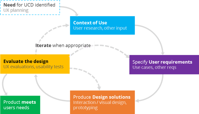
To achieve good usability and UX you can apply the iterative user-centered design (UCD) process. The best-known UCD process is described in the ISO 9241-210 standard.

Figure 3. User-Centered Design process according to the ISO 9241-210 standard
The steps can be described roughly as follows:
- A need for UCD/UX work is identified. Plan resources and time, get input and requirements from other stakeholders.
- Understand and specify the context of use, e.g. through user research and input from market research.
- Specify user requirements. This can include e.g. use cases, user interviews and other requirements.
- Produce design solutions, like UX concepts, interaction and visual design and an interactive UI demo.
- The UX design is evaluated by UX experts or testing with end users. If the users' needs are fulfilled, the design is ready, otherwise new iteration(s) are needed.
In this blog, I don’t talk about the UCD process in great detail, but I would like to say a few words about the UX evaluations, which are fundamental for good usability, as well as user studies and interaction design. The purpose of the evaluations is to find out what users need and what problems they encounter when using a system.
There are several evaluation methods for getting users’ feedback to improve usability. Some are based on evaluation by UX experts, but probably the most common is usability testing with users, i.e. the actual end users carry out typical tasks with a complete product or a prototype. Together with a usability test, other methods can be used to collect complementary data. Those are, for example, questionnaires, interviews and focus group discussions.
Conventional methods can also be turned into a continual dialogue between users and designers. In that case, users can be involved in the design process e.g. by having collaborative design workshops and allowing users to formulate their own use scenarios or concept ideas.
Overall, the prerequisite for successful design is that end users are involved in the UX design work somehow. A good way is to apply the user-centered design process, including high-quality user research, interaction design and UX evaluations.


